


MARK ROTHKO AND THE ALBUM III
the art and design for the grassy knoll's 1998 release "III"

I am a by-product of the world around me. My work exists because of appropriation. Everything that I love is reflected in my creations. From the way I construct a track, sample sounds, assemble videos, perform live, and play instruments—each is in honor of those who have moved or inspired me. The album artwork for the grassy knoll III is no different.
Designed by Grammy award winning artist Chika Azuma (Miles Davis and Gil Evans The Complete Columbia Studio Recordings Boxset), III’s cover is adorned with the Mark Rothko painting “Untitled, 1960.”

We thought clearing the rights would be a challenge but once we described the concept and our intent, clearance was granted. Not only did the Rothko Estate allow us to use the painting as the cover artwork, but in the true sense of appropriation, they graciously granted Azuma the creative freedom to flip the painting horizontally so it would read like the roman numeral III. The album was named III as a visual homage to rock bands who had used Roman numerals in their album titles—Focus, Chicago, Led Zeppelin, Van Halen.
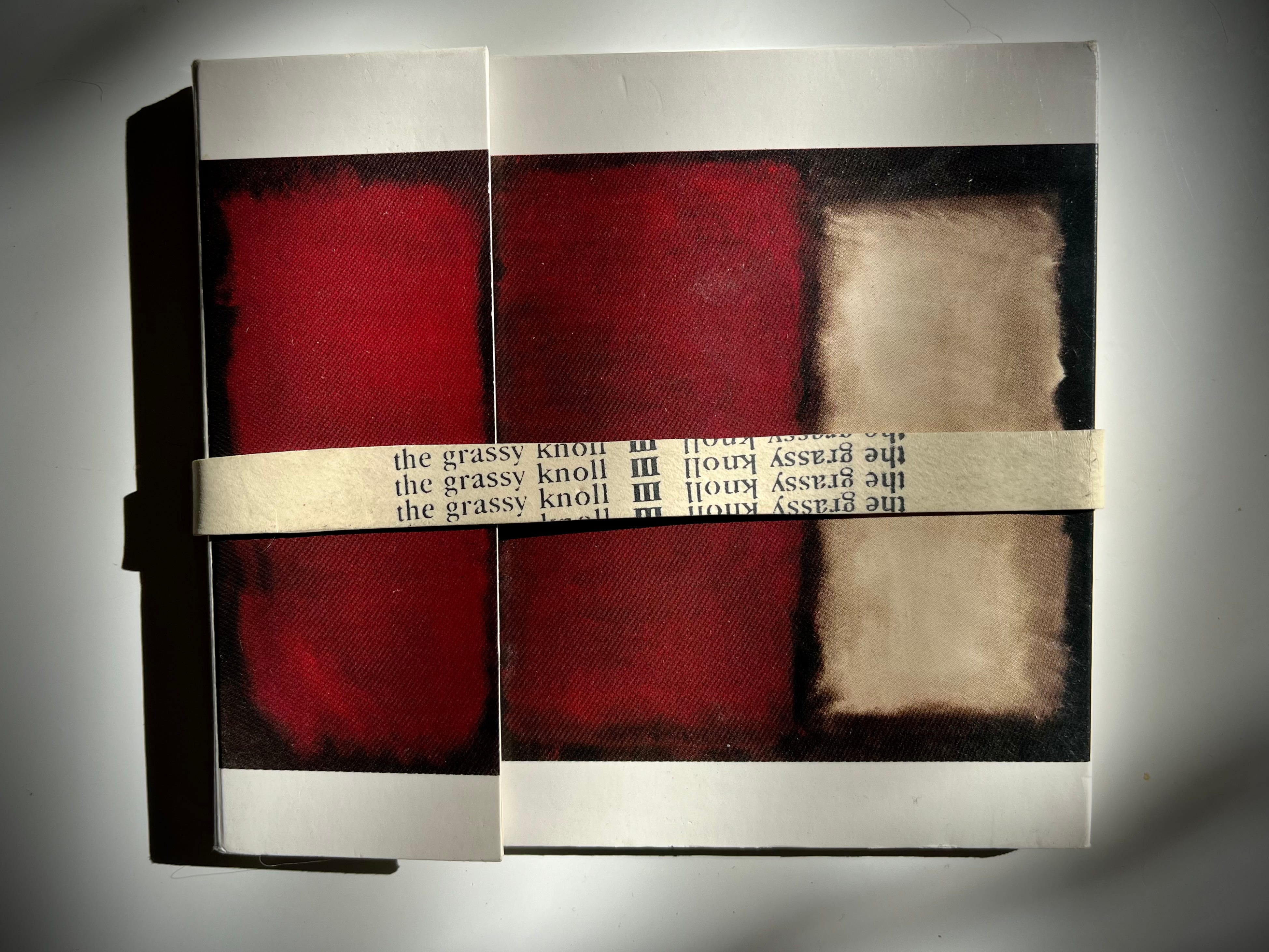
Every detail of the artwork is thought out and beautifully executed. The typeface is all lower case, quietly speaking with a subtle elegance, respectfully staying out of the way of Mark Rothko.
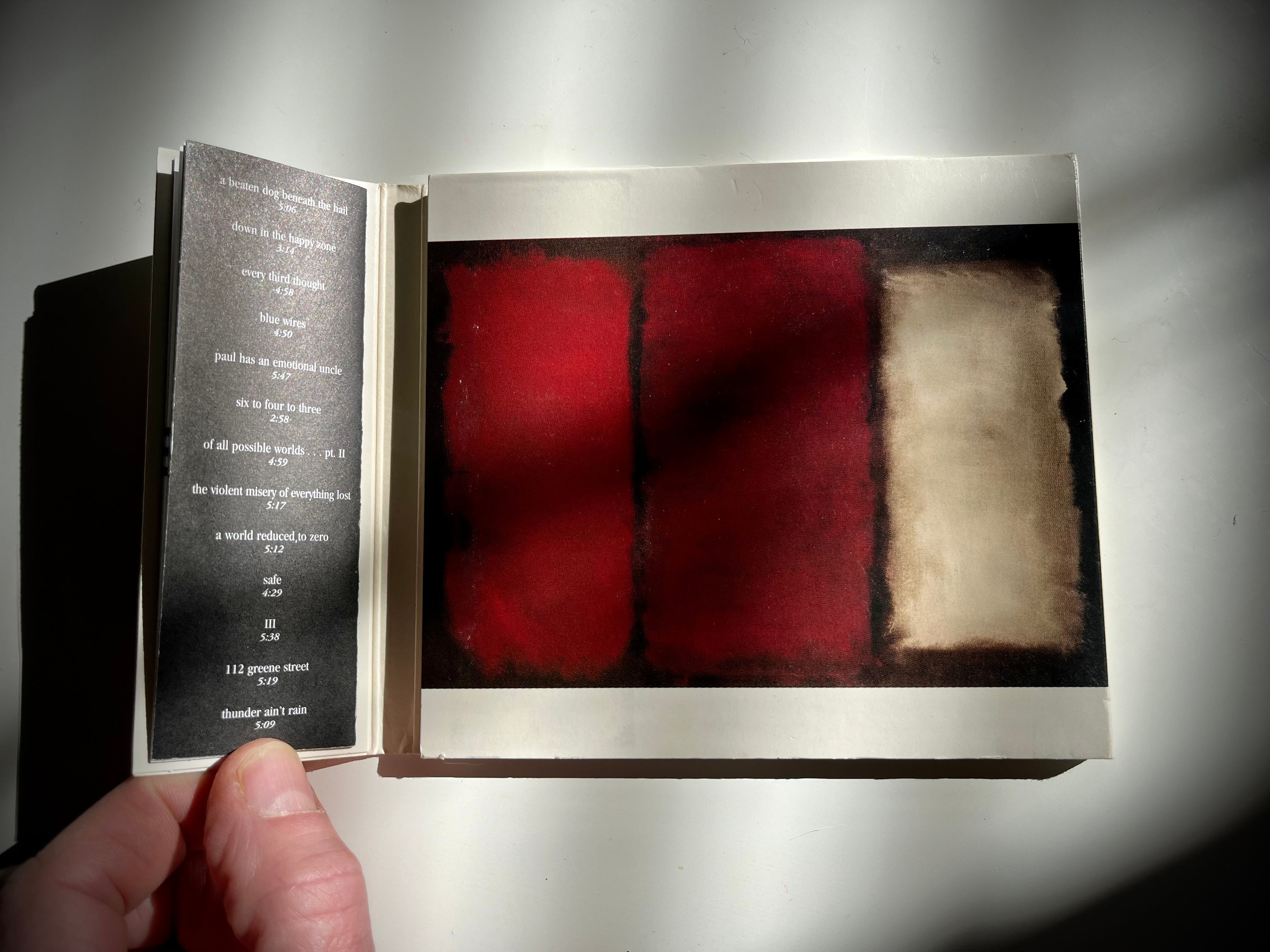
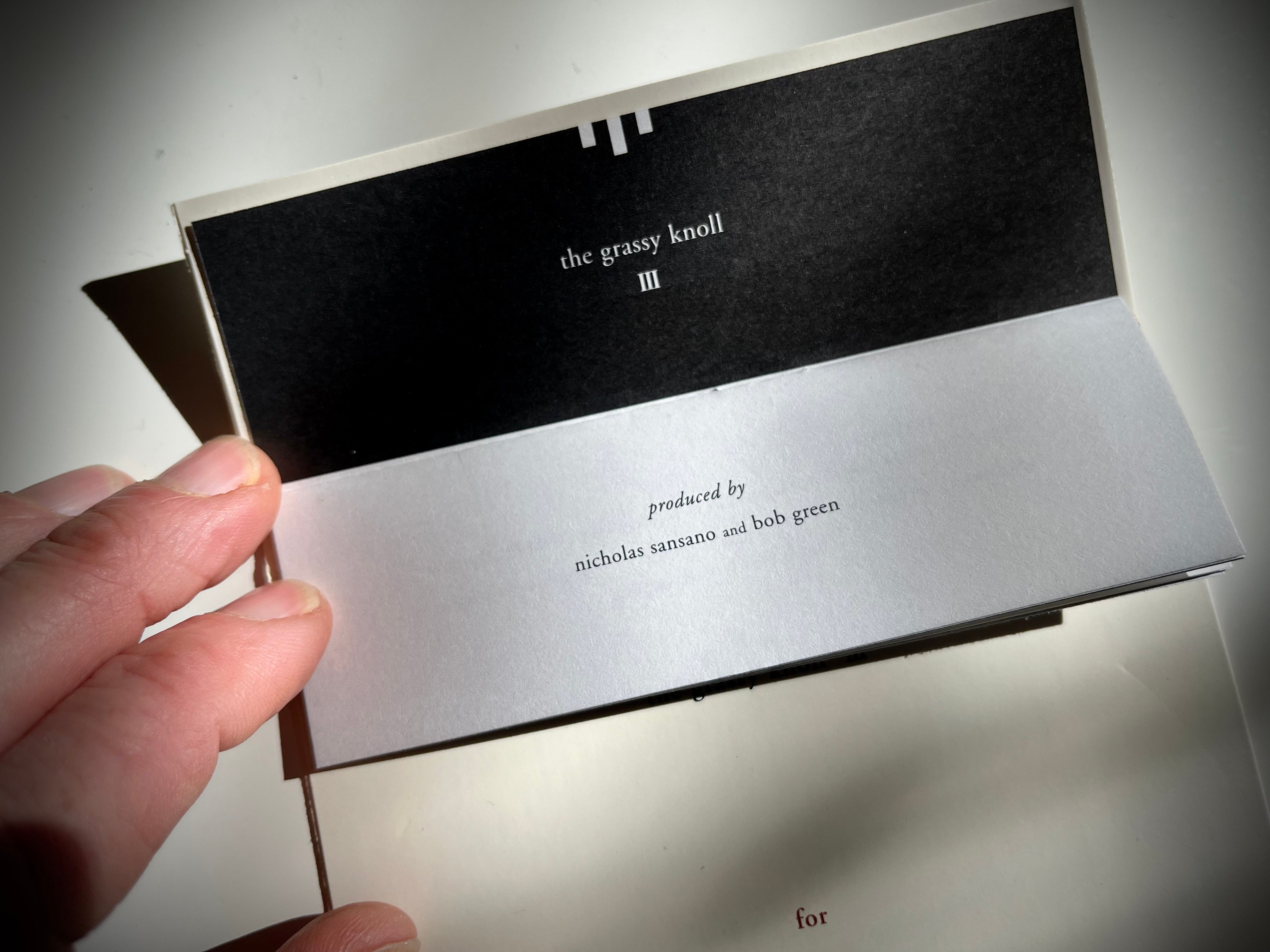
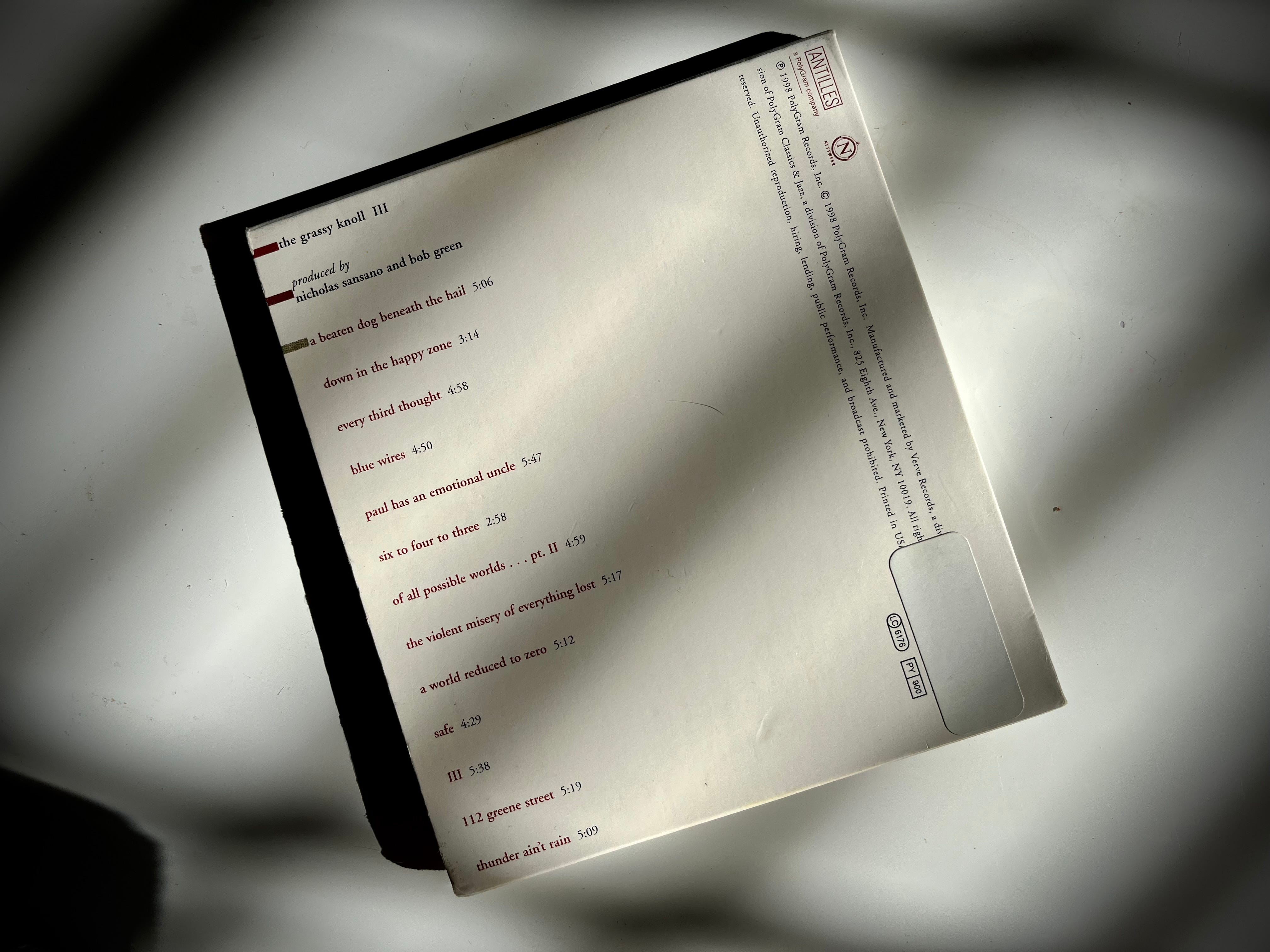
The flap, held shut by the rubber band, opens up to reveal the hidden album credits.


The middle panel contains the words, “for those who have lost”—a dedication for the loss of my Aunt and Uncle that year and for all who have felt this universal pain—all of us.
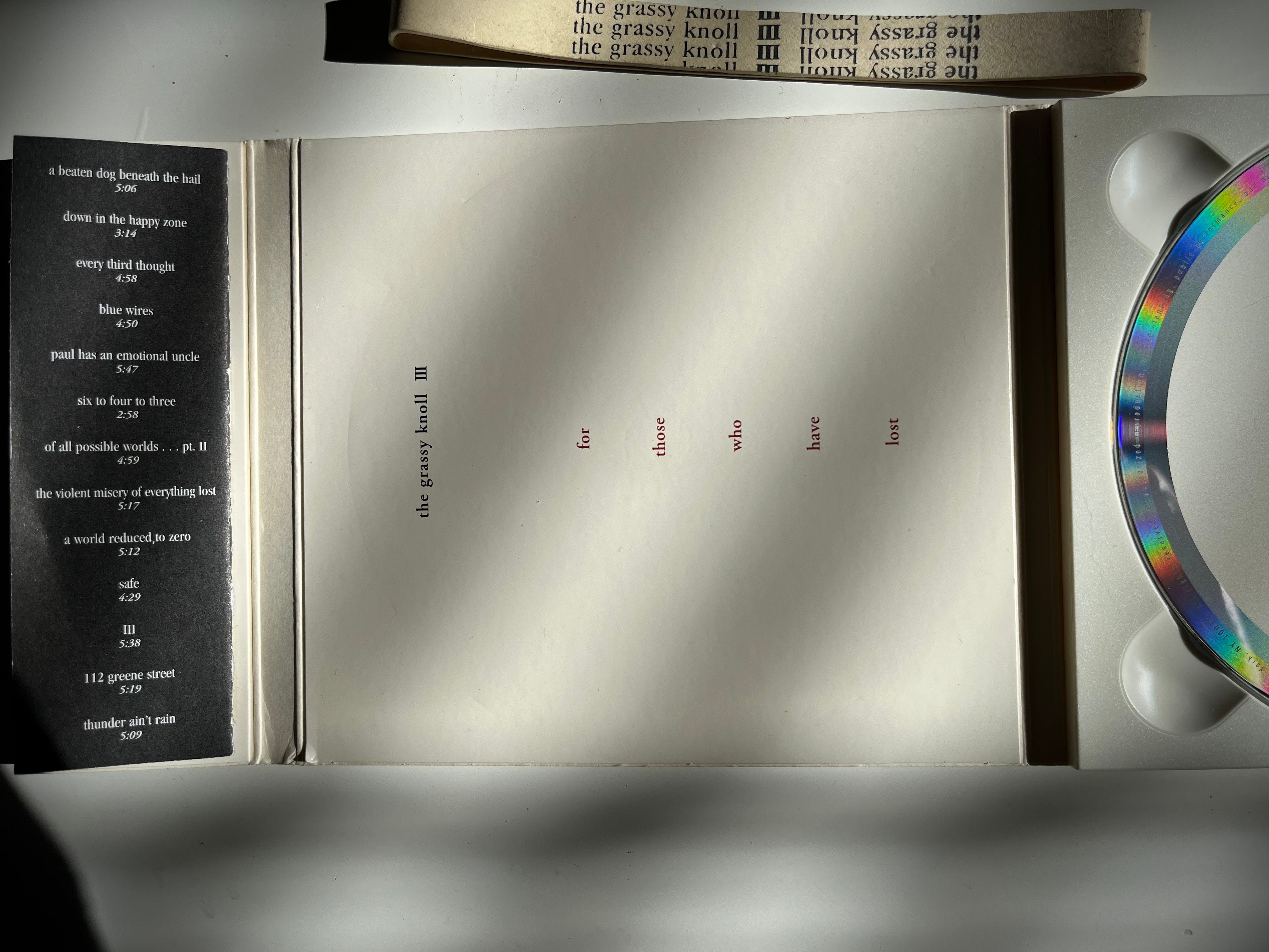
The right panel is where the CD tray lives.
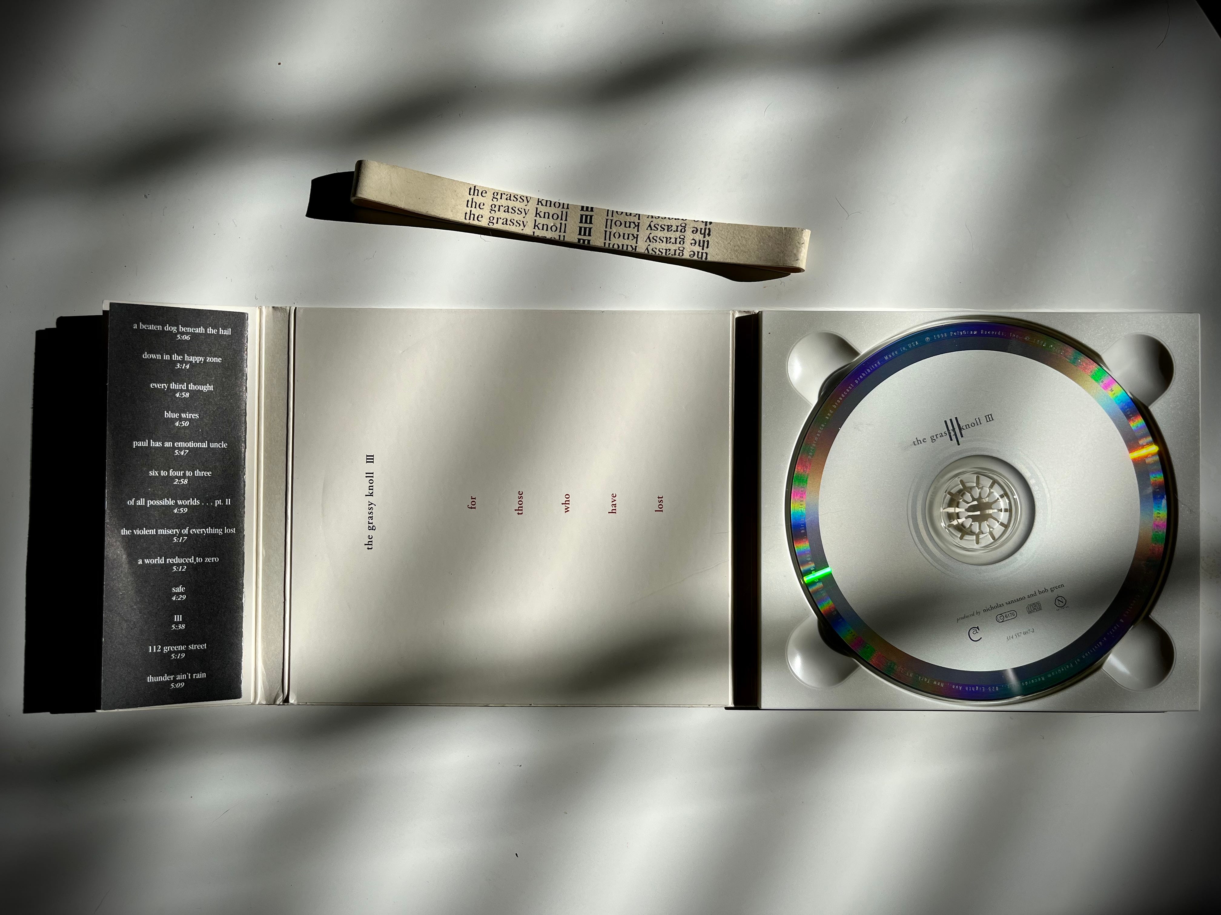
The custom-made rubber band holds it all in place. It wasn’t an easy task printing words onto rubber bands but Azuma was relentless in making it happen. It was the first time this idea had been incorporated into a CD package design.
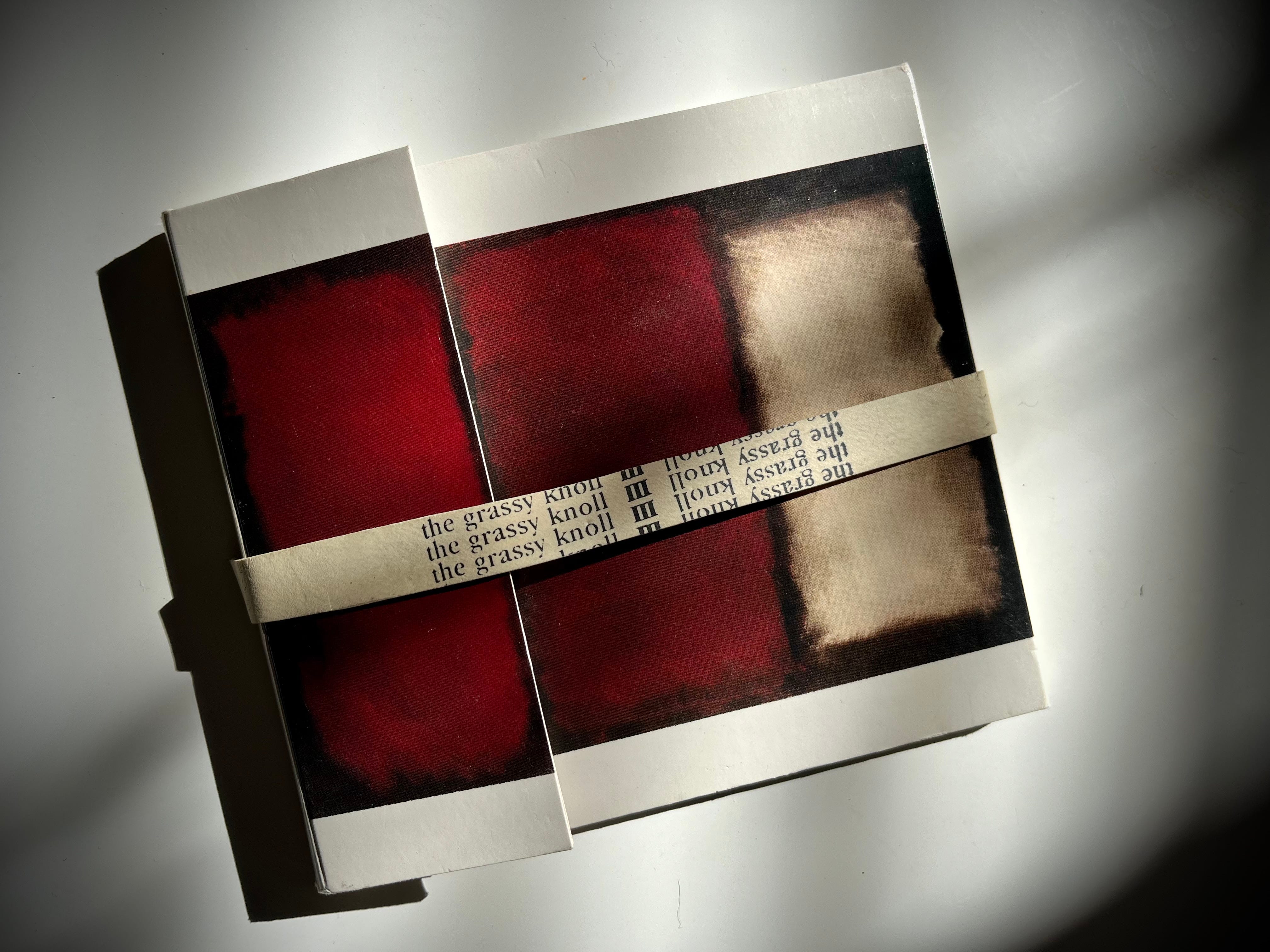
A remarkable design by Chika Azuma.
The album was on display and sold at the Museum of Modern Art in New York City.
That's a beautifully designed piece. Although I have looked at it for years, I now see elements that I had not seen before.
I love this story and that the estate was so gracious to Chika.